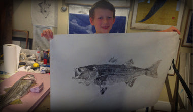
The confusion with Joe's Fresh Fish Prints and Pete's Fresh Fish Prints
There has been much confusion in the marketplace in regard to my "gyotaku fish prints" and those at Pete's Fresh Fish prints on Nantucket and also prints at "Setting the Space". The original name i came up with "Fresh fish Prints" was part of my store name "Joe's Fresh Fish prints" I allowed Pete to use the term because i was involved in the opening of his store on Nantucket, I designed his logo, his shirts, the whole nine yards, and half the prints shown in the store the first couple years were mine. I thought at the time is was a good idea to use the brand equity I had already established. Needless to say it wasn't, i assumed after we parted way the name would change since it was using the equity if the name i created and the equity of Joe' Fresh Fish Prints- it hasn't and there has and still is much confusion in the marketplace and it gets worse every year-hopefully soon this issue will be resolved and Pete's Fresh Fish Prints becomes Pete's Fish Prints. I can't tell you how many people have bought prints elsewhere thinking they were mine only to realize they are not.
Here is what to look for: The Frames are exactly the same- I gave Pete my frame source and they come from the same reclaimed frame source in Texas.
So what is the difference in prints you ask?
The chop- I use a red square from my signature with a visible JoeH. Pete use a scallop shaped mark.
The actual print-For starters lets talk about the reproductions Pete sells at "Setting The Space" in Plymouth, Dedham, Mashpee and Falmouth- those are not mine. They are also not at the Isabel Harvey store in Wellesley- I invite you to visit the store and then compare them to my prints -there is a difference. Most of my prints are originals and the paper was a wrinkly look to it---- and my limited reproductions (giclees) are different - I use actual archival unryu paper in my reproductions on prints 18" and over. You can tell this by looking closely at the paper. It has visible fibers. If you look closely at the paper you will notice how the actual fiber threads in each print including the "giclees" are different - no two have the same fiber structure. Pete's on the other hand are photographs or scans of the paper and are printed on regular paper. I number my limited reproductions up to 50 prints- his go up to 250 I believe.
The eyes: One simple way to tell the difference is to look at is the quality of scale detail and quality of eye detail. Vandingstee uses a black dot as an eye- where as i take the time to render the eyes - every fish has a different pattern - I try to make the eyes as realistic as possible.

Quality of line- if you've already bought a print from Vandingstee it is very easy to see the difference - judge for yourself-
Please take a look at both work and decide for yourself-- but make sure you are buying from the artist you think you are buying from.